mirrorMockup2.jpg

Mirror: E-commerce website

Role: UX Researcher, UX Designer, UI Designer.

Duration: 4 weeks

Client: Mirror Clothing Brand

Tools: Sketch App, Adobe Xd, Adobe Photoshop, Invision, Marvel App, Zeplin

Challenge: Established back in 1994, MIRROR is an affordable clothing store targeting wide range of age groups. With huge selection, with decent quality, and affordable prices Mirror has been a successful clothing company offline. With 400 stores around the world in 32 countries, Mirror kept their experience streamlined and well taken care of.

With online market increasing, the opportunity to explore in the field of digital has come to Mirror as well. With this Mirror e-commerce project, Mirror will rebrand and launch their new look via online in the near future.

Objectives:

  • Design intuitive and responsive e-commerce website.

  • Redesign logo and brand


Design Process

DesignProcess.png

1. Research

Goal: To research audience and the current market

Process: Secondary Research & Primary Research

Research goals

  • Identify and define target users.

  • Identify online shoppers’ pain points.

  • Determine what users’ main needs are.

  • What motivates the users to shop online.

  • Determine what the users’ expectations are regarding online clothing shop.

Research Methodologies

  1. Secondary Research

    • Market Research :Research on any trends, preferences, shopping habits of customers.

    • Competitive Analysis: Researching on E-commerce brands that are on the market currently and identify strengths and weakness of the competitors.

  2. Primary Research
    1:1 Interview: To empathize with user by obtaining information through series of questions regarding their experience with clothing stores in-store and online.

Competitive Analysis:

As part of secondary research, I Investigated various competitor’s weaknesses and strengths.

Screen Shot 2018-11-07 at 3.00.16 AM.png
Screen Shot 2018-11-07 at 3.01.22 AM.png

Contextual Inquiry

Overview:

I was able to interview 5 potential users. Users were asked about their experiences regarding purchasing clothing from in-store and online, what their normal processes are like, what their return processes are like, what was memorable, what they did like, and what they did not like; all regarding their clothes shopping experiences.

Participants:

  • 4 Female, 1 Male

  • Ages between 23 - 32

  • All have experiences buying clothes in-store and online


2.Define

Goals: To empathize and understand user’s needs, goals, and frustrations.

Process: Empathy map, User Persona, Storyboard

Empathy Map

Created an empathy map based on the interview. Each color indicates different users (total of 5 users) wrote down what they mentioned in the interview and categorized them into see, feel, think, do, pain, gain, etc. Once that was finished insights and needs were documented.

Insight:

- Users are reluctant to purchase clothes online due to fit

- Users checks through clearance/deals/offers when shopping through online.

- Users find themselves re-visiting websites with free shipping

- Users looks to purchase trendy styles at a lower cost.

Needs:

- Users need a way to look into measurements of the garment.

- Users need to know they can buy discounted items.

- Users need to know they have free shipping options.

- Users need to know they can buy trendy styles that are on the cheaper end.

IMG_8342.JPG
IMG_8344.JPG
 

User Persona

User persona was created based on user’s needs, frustrations, motivations, and goals all identified from empathy map.

Screen Shot 2018-11-07 at 3.11.48 AM.png

Storyboard

Illustrated user’s frustration and a solution into 9 square storyboard illustration.

Screen Shot 2018-11-07 at 3.06.53 AM.png

3.Ideate

Goals: To create information architecture and flows

Process: Card sorting, Site map, Task flow, User Flow

Card Sorting

Card sorting method was conducted to help design the initial information architecture of Mirror Site.

By Using optimalSort website, rolled out a open card sorting exercise to 6 participants.

Screen Shot 2018-11-07 at 3.13.54 AM.png
 

Site Map

Created a Site Map for Mirror.

Picked out key features of the site and arranged them in a visual format

MIRROR SITEMAP2.png
 

Task Flow

To understand the process that user goes through when completing a task, a task flow was created.

Mirror’s one of the most important feature (buying feature) was chosen to map out the task flow

Task Flow.png
 

User Flow

Created a user flow chart by mapping out various point of entry. Each colorway represents different ways a user can complete a task.

User Flow.png
 

4.Design

Goals: To create Mirror’s UI, key wireframes, and branding of Mirror’s website

Process: Sketches, wireframes, logo design, style tile, and UI kit

Sketches

Created 3 potential layout design for Mirror using procreate (ipad)

Focused on Image placements, Search, login, and  cart locations to guide and direct users.

Screen Shot 2018-11-07 at 3.21.37 AM.png

Wireframes

Created low-mid fidelity wireframes for Mirror

Early structures of Mirror is presented in these wireframes without any heavy visual elements distracting the designs.
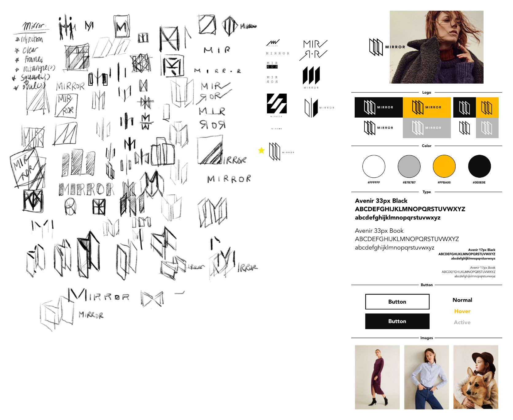
Wireframes.png

Logo & Style Tile

Sketched variety of ideas/ logo designs for Mirror

Began by writing down the word that is related to the brand and sketched based on some words. then chose couple of ideas that stood out and iterated in sketch app

Also created a style tile to show the visual choices made for Mirror

This style tile shows basic color palette, button styles, typeface, and images that will be used for Mirror.

LOGOSTYLETILE.png

UI Kit

UI kit was created to show and layout visual components that will be used in designing the interface of Mirror.

UI KIT2.png

5. Prototype

Goals: To prototype Mirror’s website to use it for usability testing

Process: Prototype, Usability testing

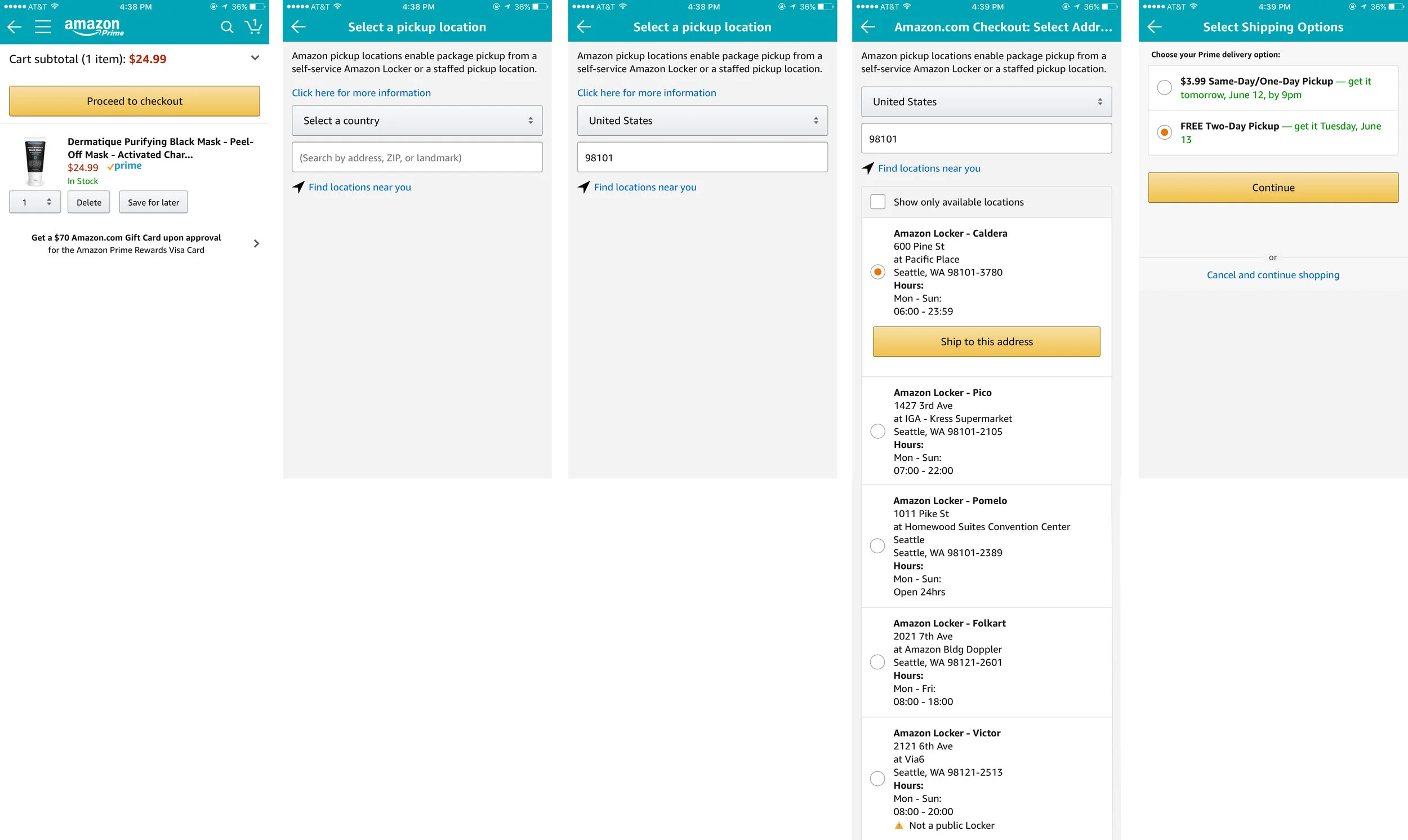
Responsive UI design

To prepare for user testing clickable prototypes were made.

Mid fidelity wireframes were refined to high fidelity mockups before prototyping in Adobe Xd

Homepage – 1.png
Android Tablet – 1.jpg
iPhone 6-7-8 Plus – 1.jpg

Task #1wireframes:

Users are prompted to search for blue stripe shirt and proceed with checkout

Clickable Prototype: HERE

Screen Shot 2018-11-14 at 1.49.07 AM.png

Task #2 wireframes:

Users are to look for black military coat and proceed to checkout

Clickable prototype: HERE

Screen Shot 2018-11-14 at 1.51.47 AM.png

Task #3 wireframes:

Users are prompted to look for a discounted dress and proceed to checkout.

Clickable prototype: HERE

Screen Shot 2018-11-14 at 1.54.50 AM.png

6. Iterate

Goals: To iterate the design to improve usability

Process: Affinity Map, Revised Wireframes

Affinity Mapping

Affinity map was created to show a visual presentation of all the data collected/observed while user testing was in process.

After success, patterns, and comments have been sorted out, insights were discovered and from there recommendations were prioritized from low to high.

Affinity MAp1.png
Affinity map 3.png

Revised wireframes

clickable prototype: HERE

Screen Shot 2018-11-14 at 3.25.42 AM.png
 

Mock Up

mirrorMockup.jpg
 

Prototype

Clickable prototype available: click HERE

UI-Design-MASTER3.gif

Redlining

9f8c5ff6.png
 

Next step:

  • Refine prototype

  • Create prototype for other key features (ex: size chart & guide)

  • User testing for iterated prototype and new prototypes

logo.png
BAnner.png


Mission

To help digitize current data collecting process for Neighborhood Birding Project (NBP) conducted from Seattle Audubon society.

About this App

As part of Seattle Audubon Society's volunteer crew, I wanted to help design an app to streamline data collected during Neighborhood Birding Project (NBP) that Seattle Audubon Society have been conducting for several years.

The project still utilizes paper and pencil/pen and requires scientists and volunteers to drop off the hard copy of their data sheet at Seattle Audubon Society's nature shop in person.

I am hoping this initial design for NBP will help streamline data and reduce any travel time, delay in data, and manual data entry.

Web 1920 – 1.png
Web 1920 – 2.png

banner2.png

Project: Taskly App

Description: Task Management App

Duration: 3 months

Team: CareerFoundry Final Project

Intro.png
Competitive Analysis.png
Task Model.png
Customer Journey.png
WireFraming.png
Visual Design.png
MockUp.png
 
MockUp.png
 
IMG_0213.PNG


AMAZON LOCKER: UX Case study

Understanding the issue:

 As an avid user of Amazon service I was quite surprised this problem wasn't addressed sooner. On my 'Amazon package's pick up' day from "Caldera" (which is located in the base ground floor of pacific place of Seattle downtown), I came across this older Asian lady asking me for help to retrieve her package that was packed away too high up for her reach. Unfortunately I, myself at a height of 5'4, was still too short to reach up to the very top rows of the Amazon locker.

 
Webp.net-gifmaker.gif
 

PROBLEMS: 

  So how are people under 5'4 retrieving these packages when placed on the top region of the locker?

                What about people with disabilities? wheelchairs?

                What if there were no person with adequate height (at least 5'5 and up) was around, how are they getting help?

 All these questions flooded my mind as I looked around to scout anyone was around that could possibly help the lady. Unfortunately for her she could not leave the locker location due to the fact that locker door was already opened.

Here's another issue with it, short people like us cannot leave for help away from the vicinity of the locker once we type in the code. because we don't really KNOW where our package will be located until the code has been accepted by the machine.

All this time I never really had the issue because packages have been quite small where it was mostly delivered to central region of the locker.

! Currently the web and mobile does not have the function to either choose where you want your package to be located nor does it ask you whether you're wheelchair disabled or not.


← I'm 5'4. Without the help of 2~3 inch heels, tip-toeing in odd positions, and helplessly jumping up and down, I cannot reach to the back on top rows of the caldera locker.


Pain Point:

Current web app:


← After user clicks "Use this address" it goes to directly to next step which is "2. Choose a payment method" 

Current mobile app:

← Same as Website, only function available is to pick a desired location of the locker. After user clicks "Ship to this address" it goes to the next screen which is "Select Shipping Options" 


Design

Web app:

Design approach: Wanted to keep the same experience for regular customer. Which means when designing this new implementation, it must be seamless where returning customers are not negatively effected.

Mobile web app:

Region section will be predetermined by the item's size you're purchasing.

To test out this theory I decided to pretend that I was purchasing a large item such as a "clear chair". As we expected, the app gave me an error indicating that the item I'm purchasing is indeed 'too large' to fit into the amazon locker. 


PRototype

Lo-Fi:

 
download (1).png
 

← Many users overlooked when link did not exhibit distinguishable color


← 100% chance of getting the link clicked when color stood out.


← 20% of users went straight for the link right next to question mark (information link explaining what the pick locker region is about) and 80% of the users clicked the information link before clicking the pink locker region

← With information gathered, proceeded with accent color that matches with mobile app color and added information link.

← By using grided moleskine journal, I draw out simple flow of the new implementation

Hi-Fi:

Design.png
 

←  Clickable prototype

Let's start out by clicking:

1) Once you input your name/or continue anonymously, click "Proceed to checkout"

2) Let's find locker near us

3) Now, let's pick a general region where you want to pick up your package from

4) Since your package is slightly bigger than expected, Region 2 is not available at this time. Let's pick a region 3!

5) Let's finalize the order and ship the item!


To open clickable prototype in new window, click HERE

Takeaways:

Amazon locker is a great invention with a mission to get customer's items to be delivered fast and efficiently. It takes away the inconvenience as "scheduled delivery" "signature required" "dropped off at the door" to be eliminated for faster and more secured delivery. The issue addressed in this case study may not be applicable to everyone but it may be applicable to certain percentage of amazon locker users when they're faced with it. I believe every user (short or disabled) should be able to use the same function of the amazon locker as everyone else with ease. If Amazon can incorporate "disabled member" friendly functions, it might even have greater impact on customers and bigger satisfied customer base. 

Notes: I do not work for, nor am I affiliated with, Amazon. I did this UX case study as I am a User Experience enthusiast who loves to solve problems. I did this case study in June 2017 after encountering unfortunate customer unable to reach for her package. 


Untitled_Artwork(2).jpg