


‘Snow’ Design system
Redefining the vision of ‘Premium’ one hook at a time.
Role: Designer
Timeline: Jan 2020 - April 2020
— Design Process

1. Empathize

Along with a senior designer in my team - we had a chance to define what the upsell guideline looks like. Upsell guideline is a new system which conveys one idea; ‘premium’. With defining the guideline we came across many ambiguous questions such as - Where is upsell getting triggered? what are some common controls? what do they look like? how do they function? what color should they be? where should they be placed? etc. With Microsoft 365 brand change announcement in April 2020 - we definitely felt the pressure from delivery date being right around the corner.
The problem with defining a guideline or any sort of system requires extensive researches on product as well as what/how this change will ultimately impact . In order to have a good starting point I decided to dig into how the WXP (word, Excel, and PowerPoint) treat their upsell moments and what their upsell interactions are currently like. As well as their in-mobile spaces.
2. Define

Due to engineering constraints - I was told to only focus on upsell moments within WXP. (Word, Excel, and PowerPoint). It would require too much resources and cost to build up an engineering team to do a complete product for all upsell touch points. Instead we will focus on small areas to define the look and feel first and extend the styling to other products (OneDrive, Outlook, etc) down the road. Below shows a general map of where most of our upsell hooks live within a prodcut.
Header (Persistent UI. Seen all across Office products)
Feature dropdown (Navigation controls with drop downs. Commonly seen in WXP)
Feature (grammar feature. Only in Word)
Feature Pane (upon interacting with a trigger feature pane opens on the right side. Commonly seen in WXP)
Rails (bottom left side. Pattern most commonly seen in OneDrive)
The area I will be focusing in this case study are features, feature pane and header.


Regular meetings were scheduled for Brand team (who defines color palettes, icons, imageries for Microsoft) as well as product team (Word, Excel, and PowerPoint) to understand what our team is defining is going to work for them as well.
Brand team was involved because the new color I’m potentially suggesting should not clash with any of the product brand colors. And for that Brand team was involved to put their inputs. The color that Brand team currently had defined for was called the communication blue along with light to dark grey plus black. (below)
Initially following Brands’ color guideline - our partner team in shared (they look cohesions across mobile spaces/ web/ and clients) made a call to use communication blue on every component in the design library. Teaching bubbles, Teaching callouts, tooltips, buttons, bizbar etc. (below)


The components with similar color scheme in a design library looks cohesive as a system at a get-go- but what the Brand team forgot to see was how each of those components look in ‘context’
Below is our current experience in PowerPoint. I chose PowerPoint because communication blue clashes a lot with our PowerPoint brand color. The upsell components did not look as half bad in Excel and Word just because brand color for them are analogous.
In theory - because orange (PowerPoint) color is complementary color to the blue color it should work out. But does it really? — Not really.
Comments from peers were:
“Blue is jarring” , “It clashes a lot” , “Our software looks very dated”
Which are not positive.
When we look at FRE (first run experience) in mobile space the color clash problem also becomes apparent. We have a dedicated upsell card where user will see when they go through their first run experience upon downloading the Office app. The example below shows the flow that was tested in Union app (aka Office app) prior to brand launch back in December.

From testing - We found out users quickly dismissed the upsell card and one person pointed out that it looked like a virus popup (at an initial go). Conclusion from this user testing was that the upsell card with differently colored theme did not look like it was part of an app when users were going through the motion.
3. Ideate

When I did a first color test against Word, Excel, PowerPoint - Word and Excel did not look half bad due to the communication blue being analogous to the product color. The one that did not work at all was the PowerPoint orange against the harsh blue callout boxes.
So in order to find color that would work for PowerPoint - I tried on all the different color defined by the brand. Found two lighter grey tones that did work ok. Rest of the colors did not work out so well because they were either 1) clashing with product color or 2) looks too dark.
After I found couple background color that aligns with brand color - I decided to add in little bit more detail (random text) to see if they were accessible. They both passed in accessibility but you can clearly tell the lighter grey callout box has much more contrast making it easier to read.
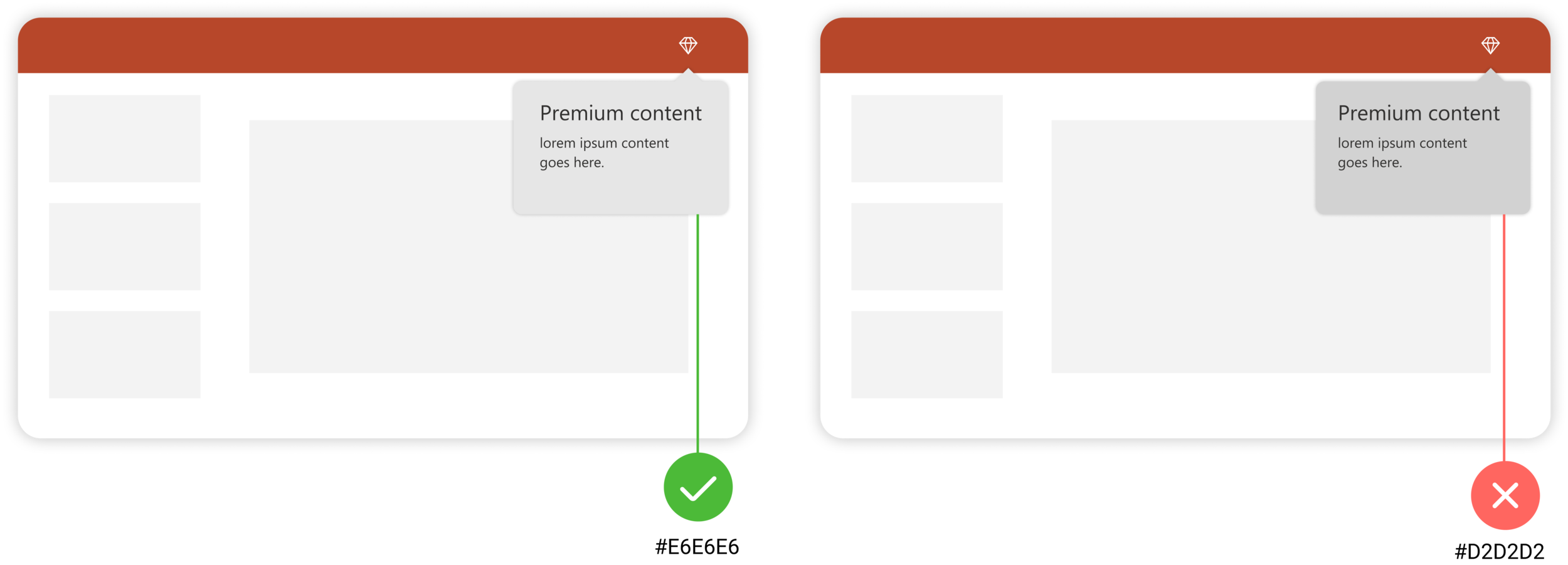
After seeing the text I decided to lean toward the lighter grey (#E6E6E6) to explore further. I put the CTAs inside the callout box to see how it would look. No matter which color I put into as part of the CTA - the contrast against the light grey background made the CTA color to look dull. Which means that one light grey tone from Brand was also a no-go.

While I was working on my other project called “contextual cart” - I kept screenshots from Microsoft’s marketing videos as inspirational. The marketing video contained 3D icons interacting in a real world in a very playful manner. The visuals used a lot of 3D “white” as a canvas to help bring out the vibrant brand color to pop. Using the similar concept I decided to use the “white” as a backdrop of callouts and highlight the brand color (in this case it would be the CTA).

Using white increased contrast ratio for text accessibility as well as button contrast. Even though the usage of communication blue was initially clashing the amount used in the case below actually works in this particular scenario.

But because the rule should also apply to the mobile version I had to do consider what it would be like for mobile space as well. Does it really work to keep it blue? — short answer is No. from the mobile flow mentioned in the beginning of the case study. - users thought that it looked like a random popup and they are more likely to get dismissed.
After considering mobile’s in-app experiences as well as Web apps - I concluded that the white background with CTAs adopting to their native app color would be the best way to make the experience feel cohesive. Brand team was onboard of changing the current blue to in app color and editor team had agreed to put engineering resources to comply to the changes.
Below is an example components (callout boxes and badging) for PowerPoint, Excel, Word, and Outlook that had been shared to Brand team.

4. Prototype

You can view PowerPoint prototype: HERE
Or you can view the mocks below where I was using some of the snow fabric component I designed.
5. Test

Sadly - COVID-19 is effecting research resources and production currently.
TL;DR / Next steps / Final thoughts
Defining, re-defining some of already built in library component is a very complex at the same time rewarding work. My task to justify some of the color choices of the upsell components taught me a lot of different aspect of design world. It made me think more about how to collaborate and how to engage with other teams. This project was more persuading the stakeholders by providing the visuals rather than a solid backup from research which is slightly different from my other projects.
All in all it was an interesting project - would love to solidify the color decision making even with research in the future.
The upsell components are constantly changing and it will always change as long as Microsoft provide new product and new features. I believe the re-designed color choices made in this snow design system should uphold for several years. The rule defined here should also be applicable for any new product that Microsoft releases as well.